Towards quantifying the userexperience
When you ask a DBA to look at the performance, he or she will nearly always look at the technical metrics, such as CPU consumption, IO, locking and blocking, waitstats and the like. During an incident he or she will check these metrics for trend deviations, componentstress or unusual waits. And when a corresponding fix is found the DBA often asks the enduser if the problem is gone. Why would that be? Doesn’t the DBA know the enduserexperience? If the DBA doesn’t know this, how can an assesment be made of the proposed fix? It seems that the DBA view is missing something – and that is the performance situation as the enduser is experiencing it.
In this serie, I will show you how I measure performance and explain several use cases of such performance measurement. I’ll start out with an oversimplified example and will adress the added complexities in subsequent posts.
Measuring performance – what is its metric?
Performance consist of only 2 elements: the workload and the corresponding runtime, also called duration, elapsed time or execution time depending of the RDMS-vendor terminology. I’ll use ‘execution time’ in this blogpostserie.
A database has a heterogeneous workload, so a table called a Workload Table is created:
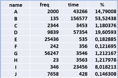
In the above example there are 10 different workloads. Think of reports that an enduser requests. Or it could also be transactions or batches that are started. We’ll name them here A to J. Next column is the frequency, or number of times these reports ran during a business cycle. A businesscycle is usually a month, but you can choose also a week, if that suits your business workload better.
The third column is the cumulative executiontime of the report. So in this simplified example Report A ran 2000 times with a grant total of 43266 minutes. In the last column there is a percentage of the execution time. Let’s order this table by Execution Time and add a pie-chart of the percentages:
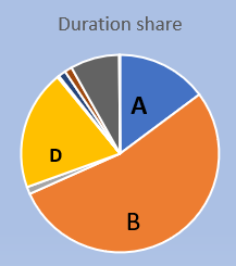
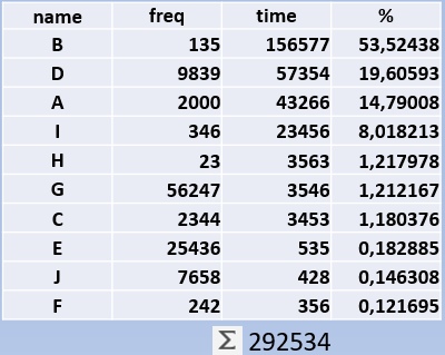
So can we see here that the overwhelming majority of the time is spend on just 3 reports. Note that there is no clue if these reports run efficiently or not – what you see here is a pure ‘time-writing for computers’.
Here we can see the difference with a DBA who checks if there are inefficiencies in the database and tries to improve them. That DBA may end up fixing a CPU intensive query – but how big a slice of cake are you attacking?
With the workloadtable you can see how much gain you theoretically can have. And if you compare the before-the-fix and after-the-fix workload tables, you can tell how much percent impact your tuning has had. There are more uses of this workload table. I once made an estimation in an upgrade scenario: with the workloadtable in hand, I showed that most of the time was in 3 SQL statements. All I did was to check the resource consumption of these 3 statements on the new system (they were the same) and I had a back-of-the-envelope estimation of 80% of the workload.
The aggregate value: Total Execution Time
If in the workload table you add up all the executiontimes, you will get the Total Execution Time (TET) for that business cycle. This is a handy aggregate value for trendwatching, much like economists publish the Gross Domestic Product aggregate. I once had done a tuningjob and made the following trendgraph of this Total Execution Time.
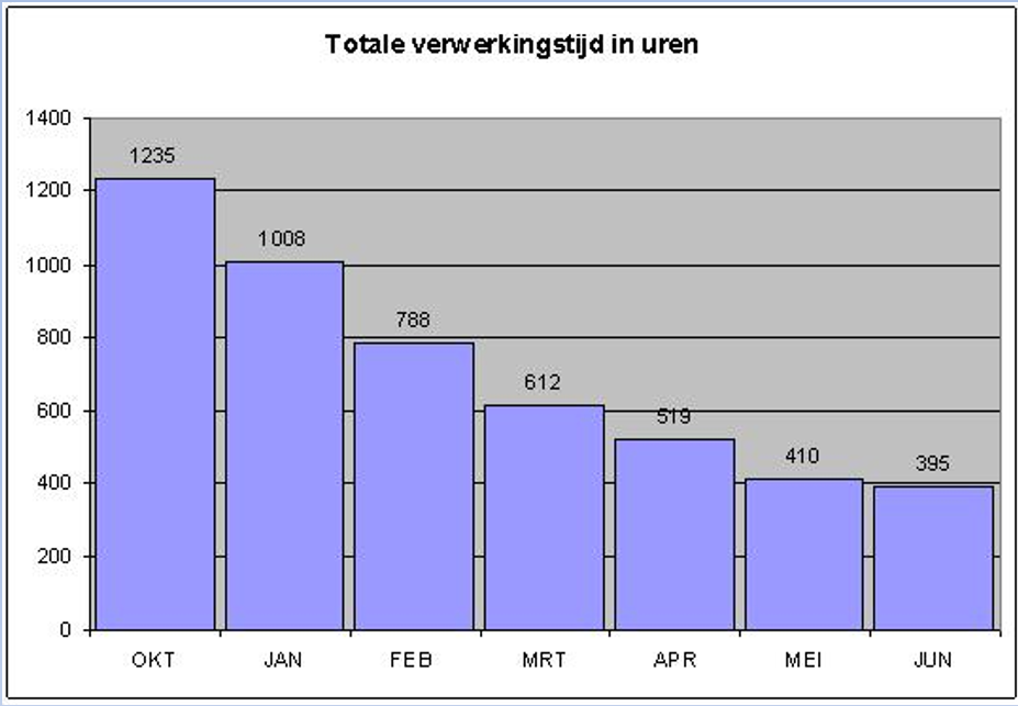
The workload was about the same every month, so the TET time is a good indicator of the tuningsresults. From 1235 hours per month to around 400, I therefor claimed to have tripled the performance of this database.
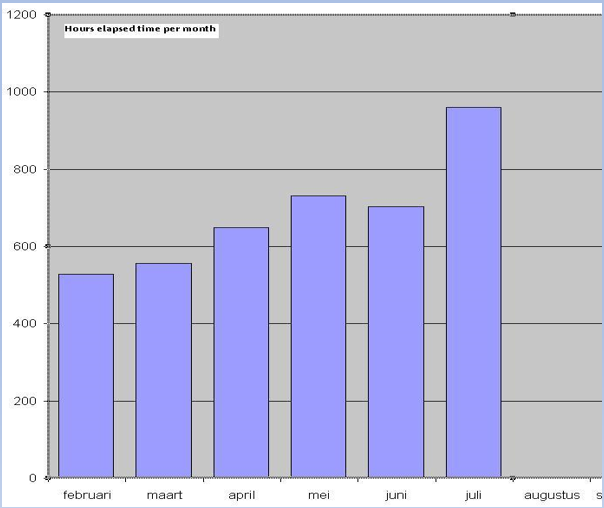
The above graph was from a geospatial database, which is characterised by lots of small snappy SQL statements and lots of resource overhead. I was able to show this upward trend. Not because the system was slower, but because more work was added to it. Yes, nobody complained or was concerned about the performance, but I calculated from the resource consumption of the main SQL statements that in 6 month the system would come to a halt if the current trend would continue. So this workload table helped me to proactively avoid a problem.
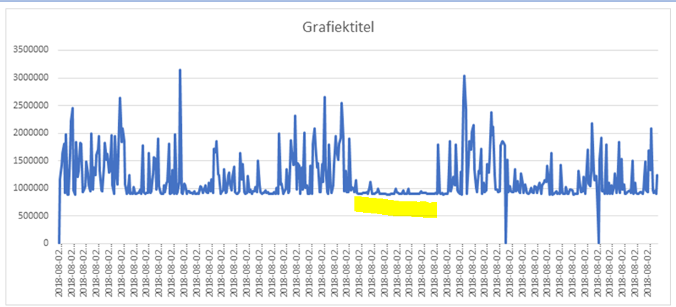
In this next example I use my method during a performance incident. I marked the time of the incident with the yellow bar: the graph doesn’t show a large peak, but instead goes flatline. This meant that no work entered the database as there was a bottleneck on the applicationserver. This took the database out of the equation with one single graph. A graph that everybody can understand.
Wrapping it up
Trendwatching for performance can be done by creating workloadtables based on executiontimes and aggregated these values. As we are now introduced with the basic terminology, we can now have a look at the way this method can help us with a performance problem.